DeFiner Labs
DeFiner Labs is a tech-centric, blockchain-enabled company operating in both B2B and B2C sectors. They provide protocols and tools like ZooEx and Typelt, addressing user experience challenges in DeFi lending and indexing.
MY ROLE
UI/UX Design Intern
Visual Designer
TEAM
1 Product Manager
3 UX Design Interns
2 Developers
TOOLS USED
Figma
Adobe Illustrator
TIMELINE
July 23 - Sept 23
3 Months (Remote)
We successfully delivered website and mobile app redesign using agile practices such as iterative design and continuous feedback. Weekly team reviews and early developer involvement played a crucial role in meeting tight deadlines and ensuring the incorporation of feedback at every process stage.
Note: Due to NDA constraints, I can't disclose specifics about certain projects, including unpublished parts and my design/development processes. However, I've outlined the number of projects, challenges faced, outcomes achieved, and key learning experiences.
Project 01
Overview
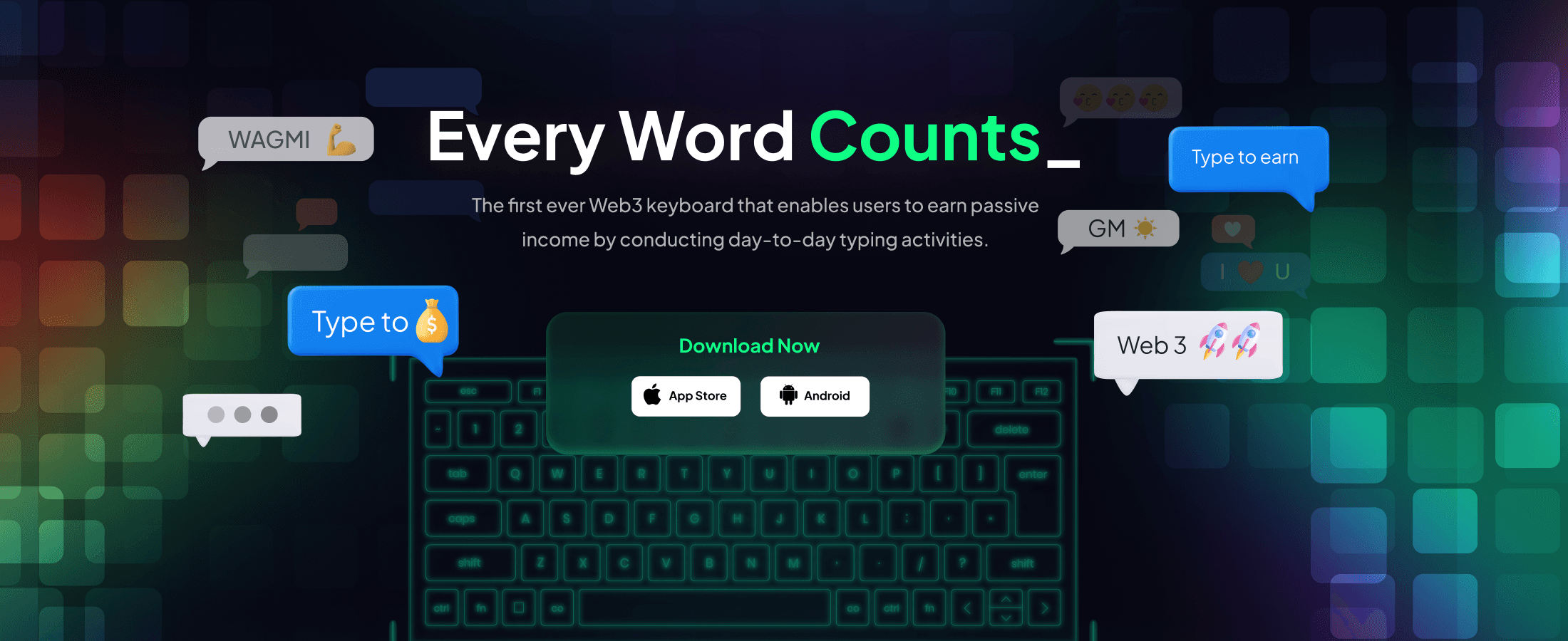
Type!t_Web3
TypeIt, a flagship client of DeFiner Labs, leads the Web3.0 revolution with its groundbreaking keyboard application. This transformative tool not only streamlines everyday typing tasks but also seamlessly enables users to earn passive income, redefining the user experience by integrating effortless typing with the principles of decentralized finance.
The Issue
TypeIt faced usability challenges such as confusing navigation, misaligned illustrations, unfocused modules, potential user confusion between sections, and less noticeable CTAs. The outdated design complicated user journeys, introduced inconsistencies, and posed a risk of misalignment between NFT profile pictures and refreshed branding, impacting overall brand value.
Outcome
The TypeIt project's redesign increased conversation rates and boosted user engagement, building trust and driving enhanced sales along with a notable increase in app downloads.
Design Principles
Through client and team discussions, we defined 3 design principles to guide the overhaul process for all projects. These principles serve as the foundation for redesigning Type!t's mobile and web versions.
Enhancing Perceived Value
Use specialized popups, simplify transactions, and establish a professional, high-tech theme.
Reducing Content Overload
Designed a product comparison page to streamline content and enhance user experience, facilitating easy navigation and helping users assess their specific requirements between Type and Word.
Trade and Connect
Boost user engagement by displaying live trading data, creating social portals, and guiding users to explore opportunities in the secondary market.
Solution
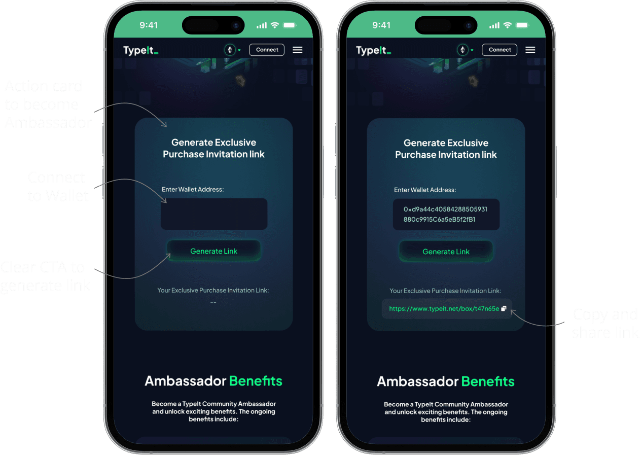
Enhance Perceived Value with Instant Invite Links
Simplifying wallet linking and shareable links encourages user engagement through incentivized referrals, aiding insights into user behavior and assessing referral strategy effectiveness.
Added Invitation Leaderboard to strengthen community cohesion.
Boosting Trade Transparency with Secondary Markets
Enhancing accessibility to the secondary market, users can select entrances aligning with their trading strategies and needs.
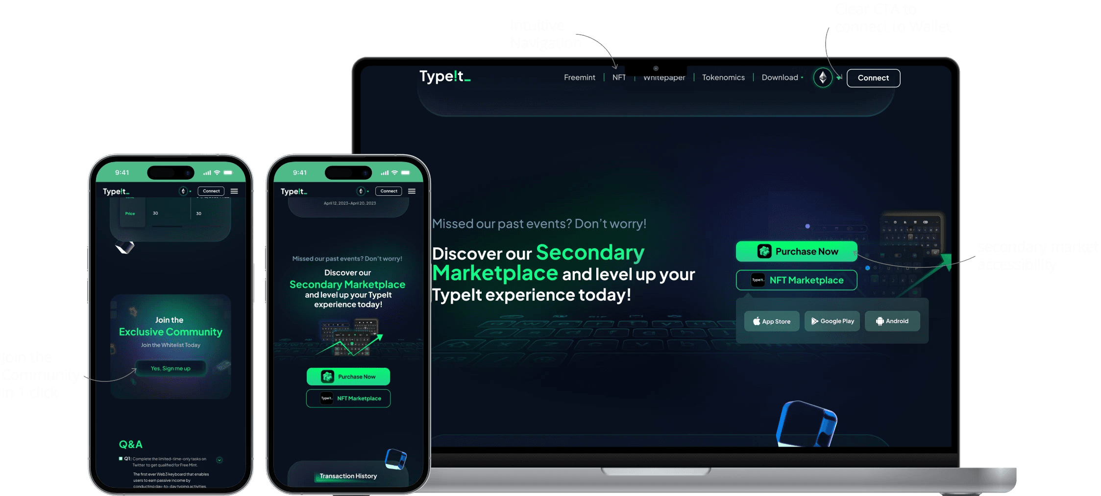
Product Comparison to Reduce Content Overload
The product comparison page simplifies token comparison for quick decision-making and fast loading times. With optimized performance and clear visuals, it enhances user understanding and engagement.
Project 02
Overview
Type!t Profile NFTs
Type!t aimed to align its NFT user profile with its new branding to keep it minimal and memorable branding. Collaborating with two fellow interns, I led the update of TypeIt's NFT designs and client presentations.
Process
Research & Analysis
During the research process, the team started by identifying user needs and exploring current NFT trends and themes, aligning them with our existing designs and broader NFT community. To guide our design decisions, we established a set of guidelines that prioritized visual engagement, community involvement, and the promotion of passive income through typing, aligning closely with TypeIt's overarching objectives.
Design
Following our research, we transitioned into the design and development phase. Utilizing Figma and Adobe Illustrator, our team embarked on creating a diverse range of NFT wireframes. These included various themes such as Customizable Keycaps, QWERTY Layouts, and Mood Emojis, aiming to offer a personalized and engaging user experience. Our objective was to develop 1000+ NFT frames that featured different facial expressions, clothing, and accessories, allowing for a high degree of customization and personalization.
Failed Design Shift
Despite none of the proposed stories for NFT designs being chosen, the team decided to exclusively use the keycap NFT design. Centered around the theme of Individual Heroism, this choice celebrates and highlights the achievements of individuals who have made a difference. By using the TypeIt keyboard, users become part of a larger movement, playing their heroic role in the world of Web3.
Project 03
Overview
ZooEx_DeFi Platform
ZooEx is at the forefront of the decentralized finance (DeFi) sector, offering affordable multi-chain index and leveraged tokens. This platform enables users to engage in decentralized trading and investment across various blockchain networks seamlessly.
My role involved collaborating with other design interns to establish a comprehensive Visual Guide and Design System for ZooEx, enhancing the product's usability and brand consistency.
The Issue
ZooEx was initially known as HODLer, and upon joining the team, they were already in the process of redesigning the product to align with the new brand name and identity, ZooEx.
During redesign projects, the team had to create new components libraries, and style guides from scratch, leading to a lack of design consistency when multiple people collaborated on the same file.
Design and Implementation
Our Approach
We initiated the process by researching and acquiring a foundational understanding of design systems, referring to established systems from companies like Apple and Google.
Following that, we created a style guide for the new system, incorporating elements such as brand logos, grid systems, spacing scales, typography scales, color systems, and the redesigned modal layouts.
01.
Foundational Understanding
Identify ZooEx's core visual elements like brand logos, grid systems, spacing, typography, and color schemes to maintain brand integrity across all designs.
02.
Ensuring Consistency
Design a component library and redesigned modal layouts, prioritizing intuitiveness and scalability to achieve uniformity across ZooEx's platform.
03.
Implementation Guidelines
Implemented a user-friendly system to ensure smooth teamwork among designers and developers, maintaining design consistency.
Experience Overview
Constraints
Adapting to Remote Dynamics
In remote collaboration, language barriers and time zone differences posed significant hurdles. Communication mainly in Mandarin and a product manager in a different time zone led to delayed discussions and feedbacks. To overcome this, platforms like Slack, Asana, Gather were used by the teams to ensured consistent updates and bridged the communication gap.
Direct Design Engagement
I directly participated in the design process, deviating from the usual school project sequence where research precedes design. This shift prioritized design decisions without the traditional research-first approach, providing valuable insights and hands-on experience in real-time design scenarios.
Learnings
Handling Multiple projects
Given the small team size, it allowed me to wear multiple hats and operate in a fast-paced environment. My team had to iterate on designs, make quick decisions, and this experience helped enhance my adaptability and agility.
Getting Approvals is tough
Working alongside multiple designers, I learned the importance of selling and defending ideas, not just in design but also in overall process decisions. It made me ask questions like: How can I show the value of my designs? Can I convince my project manager that these choices add value?