
Maharashtra Tourism (MTDC) Website
Revamping the Maharashtra Tourism website to improve user navigation, information architecture, and overall user experience.
The Maharashtra Tourism website, run by the Maharashtra Tourism Development Corporation (MTDC), promotes the state’s attractions, cultural heritage, and activities, helping visitors plan their trips.
My Role
Information Architect
Team
Solo Project
Tools
Axure RP, Lucid Charts, Figma
Timeline
March 23' - May 23'
Skills
User Research, Information Architecture, Heuristic Analysis, Content Audit, Wireframes, Task Analysis
Problem Space
TypeIt faced critical usability challenges that impacted user engagement and retention.
01
How might we simplify the wallet-linking process to reduce errors and drop-off rates?
02
How might we improve the website’s navigation and content structure to make it easier for users to access key features and understand the platform’s value?
My contribution
I led the redesign of TypeIt’s Web3 app and website. My key contributions included simplifying the wallet-linking process, creating a new invitation dashboard, and optimizing the content layout to improve usability. I also designed 800+ customizable NFT profiles to enhance user engagement and ensure seamless platform integration.
Overview
About MTDC
The Maharashtra Tourism website serves as a gateway to explore the rich offerings of tourism in Maharashtra, India. Despite showing tons of information on attractions, accommodations, and activities, the website currently faces a usability challenge with its less-than-intuitive navigation and information overload. Users find it challenging to efficiently complete tasks and access the specific information they seek.
As a part of my Information Architecture course at Indiana University, I conducted research and redesigned the webpages and user testing to analyze the existing design and propose strategic design changes to enhance user navigation and overall user experience on the Maharashtra Tourism website.
Problem Statement
How might we improve the Maharashtra Tourism website's navigation and information organization to make it more intuitive and less cluttered?
Outcome
Optimized user experience through a user-friendly system that enables users to navigate the website intuitively, complete desired tasks efficiently, and find the required information.
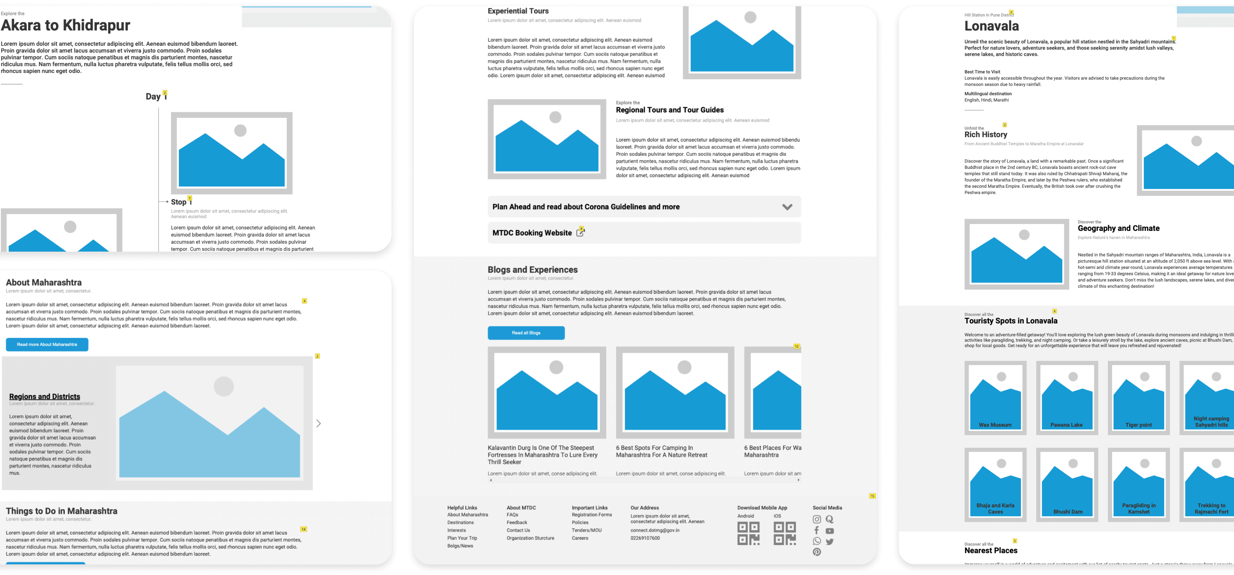
Design Glimpse
Before & After
As part of the solution, my goal was to redesign the website's information architecture, focusing on creating an intuitive navigation system and conducting a content audit to streamline the user experience.
Jump to the Solution

Redesigning the Information Architecture led to:
01.
Intuitive User Navigation
03.
Consistent Page Layouts
02.
Clear and Actionable lables and CTAs
04.
Clear User
Status Visibility
Discovery
Heuristic Evaluation & Suggestions
Before restructuring the website, I initiated a Heuristic Evaluation using Jakob Nielsen's 10 general principles. This evaluation aimed to identify usability issues grounded in established principles, thereby crafting a roadmap to enhance the overall user experience.
Recognition Rather Than Recall
Recognition challenges, like ambiguity between PDFs and URLs and non-clickable breadcrumb links, highlights the need for clear visual cues to enhance user recognition and navigation ease on the tourism website.
Improved navigation with intuitive design, included breadcrumbs for easy tracking, and integrated visual cues.
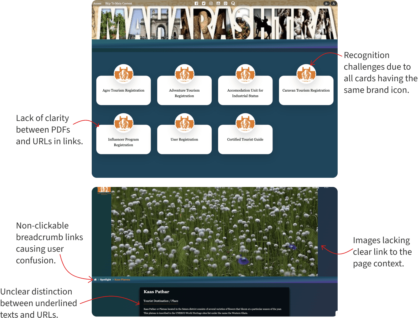
Consistency and Standards
Recognition challenges, like ambiguity between PDFs and URLs and non-clickable breadcrumb links, highlights the need for clear visual cues to enhance user recognition and navigation ease on the tourism website.
Ensured design consistency with uniform card sizes, CTAs, and branding, following standard navigation patterns

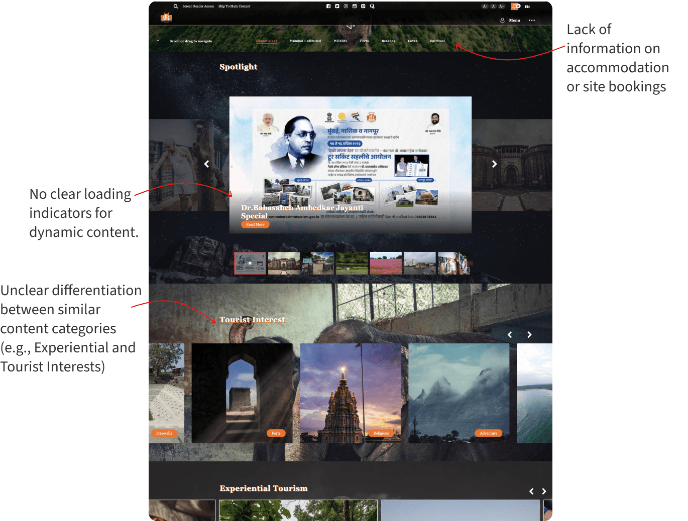
Visibility of System Status
Users lack vital information on accommodations and site bookings, and unclear loading indicators for dynamic content diminish the system's transparency and user-friendliness.
Provided clear feedback on user actions, and indicated clear ongoing and completed processes.
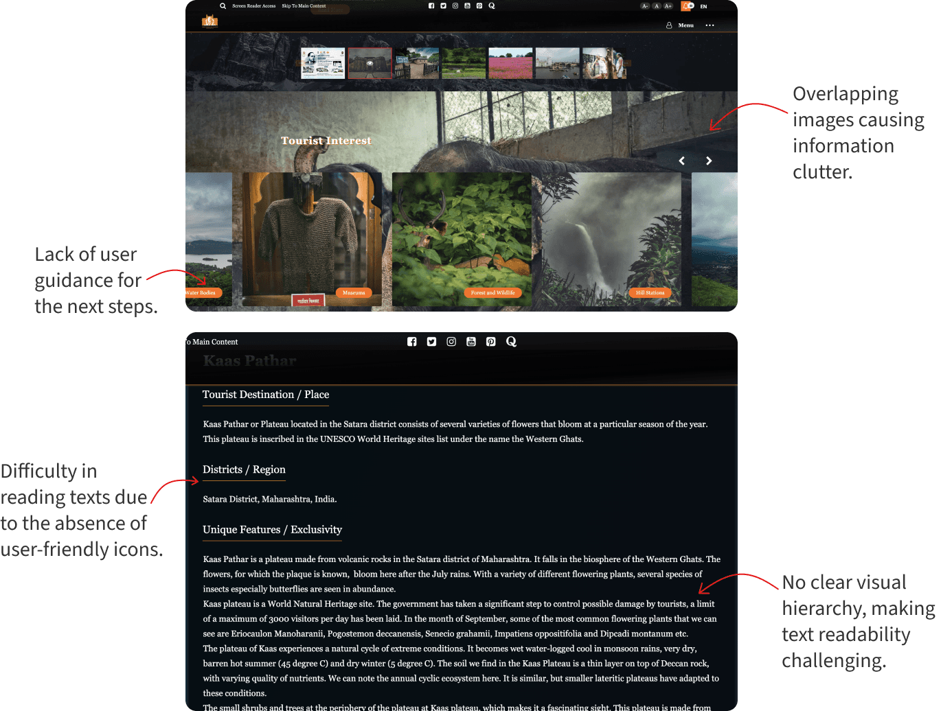
Aesthetic and Minimalist Design
Design issues, like overlapping images and a lack of user guidance, directly impact the tourism website's usability. The absence of user-friendly icons affecting text readability emphasizes the need for a more streamlined and intuitive visual experience.
Removed unnecessary clutter, added negative space, and opted for clean, industry-standard designs.
Assumptions & Limitations
Assumptions were made about the business goals and target audience of the Maharashtra Tourism website due to its academic nature.
A manual content audit was conducted because of the unavailability of website analytics data, limiting comprehensive data-driven insights.
Content Audit & Findings
I analyzed 1000+ web pages on the Maharashtra Tourism website, categorizing them into existing pages for evaluation. Filtering sections in an Excel sheet like Keep/Delete, Usefulness, Easy to Read, External Links, and so on, helped assess the content and site map comprehensively.
Divided the pages into Categories

Identified patterns through ratings, relevance and improvements
Key Insights
Unclear Website purpose
The website does not indicate whether it serves as a booking platform or solely provides information. Additionally, crucial content is dispersed and labeled ambiguously, resulting in a poor user experience.
Content Gaps
Outdated and irrelevant content on most pages highlights the need for creating pertinent information to fill gaps.
Cluttered Navigation
Primary navigation, cluttered with unimportant parent categories for consumers, leads to confusion and increased cognitive load.
Information Overload
Most pages lack a clear text hierarchy, making it hard for users to spot important information amid irrelevant content.
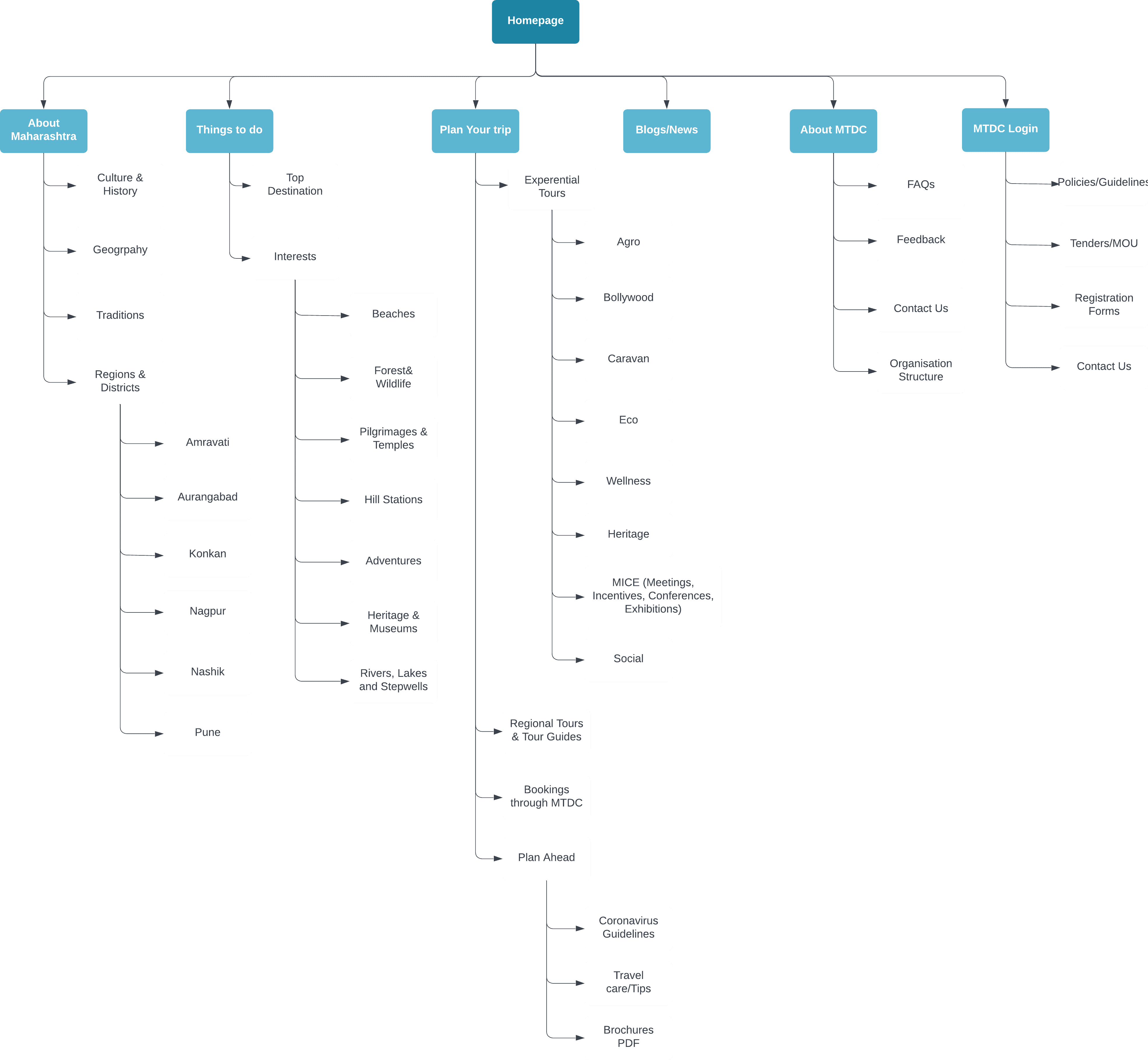
Site Map
Revamping the Navigation
After a heuristic evaluation and content audit, I found the website's navigation to be confusing. To improve it, I used a bottom-up approach, introducing parent and child categories for better user understanding. Research on tourism websites informed the final site map, merging parent categories to enhance coherence. In the "Things to Do" category, I considered user needs, incorporating sections like "Top Destinations" for a more user-centric content organization.
Solution
Wireframes & Testing
I initiated the design process by sketching wireframes as an initial conceptualization, later transitioning them into a more refined representation using Microsoft Axure.
Design Decisions
An overview of the Design descisions I made after an extensive research.
01.
Optimizing Navigation
The main issue was a cluttered navigation bar. To streamline, I reduced subcategories and revamped the drop-down menu for a more efficient information hierarchy, reducing cognitive load by revealing only the specific section users intend to explore.
02.
Content Chunking
Streamlined each page to meet user needs, emphasized call-to-action buttons, and added clear headings and subtitles to prevent essential information from being lost in the text, ensuring a user-centric and organized presentation.


03.
Visual Hierarchy
Icons were incorporated on the details page alongside text to create a clear hierarchy for different modes of transport, improving visual communication.
Outcome
Measuring Impact
To measure the impact of the product, I used a combination of quantitative and qualitative data. I tracked user engagement metrics such as the time taken to complete a task, and evaluated user feedback through surveys.
01.
Navigation and Structure
4/5 users found the top navigation easy to follow and intuitive, and the content was properly chunked, making navigation and information glancing better.
02.
Simplified District details access
5/5 found it less confusing to access district details, including navigating through multiple layers, compared to the existing site. This highlights the need to simplify and streamline the process of obtaining district information.
03.
Visual Clarity with Icons
4/5 users showed an improved understanding of transportation options with the inclusion of icons and consistent visual elements, indicating the effectiveness of visual enhancements in aiding information understanding.
Lessons Learned
Reflecting on the project outcomes
01.
Navigating Clarity
Ensuring a website's structure goes beyond aesthetics; it serves as the compass for a positive user experience. Dive into the pivotal role of decluttering and addressing information architecture issues, particularly when tailoring designs for niche audiences.
02.
Elevating Strategic Design
Employing research methods like heuristic evaluation, and user testing, I deeply understood the website's dynamics. A content audit highlighted areas for improvement. This project reinforced that effective website information architecture goes beyond aesthetics, emphasizing the significance of user-centric design and thorough research.
Thanks for visiting my portfolio!
I'm open to new opportunities and would love to hear from you.