
Work
Work
Work
Fun
Play
Play
About me
About me
About me
Resume
Resume
Resume
Jump to section

DiscoverU Health
Simplified the B2C healthcare plan comparison and enrollment process to reduce friction and support quick decision-making.
As the lead UX designer, I collaborated with our co-founder, developers, designers, and healthcare advisors to simplify DiscoverU Health’s member enrollment experience. The goal was to reduce friction for both insured and uninsured users, improve plan clarity, and better communicate the value of concierge care services.
My Role
UX Designer
Team
3 Designers, 2 Developers, CEO
Tools
Figma, FigJam, Slack, Google Surveys
Timeline
12 weeks (July 24' - Sept 24')
Contributions
Primary Research, Heuristic Evaluation, Competitive Analysis, User flows, High-fidelity prototypes, Developer Handoff
Problem
A broken enrollment flow and unclear plan options kept users from trusting the platform or enrolling in concierge care.
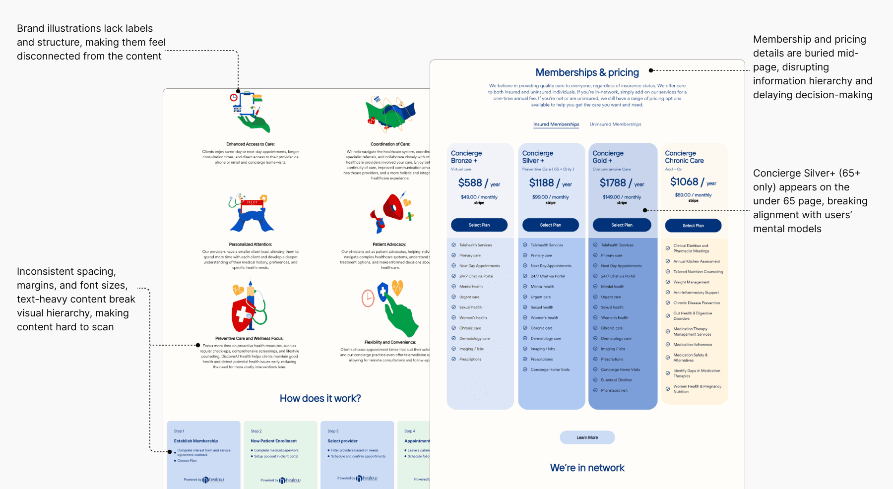
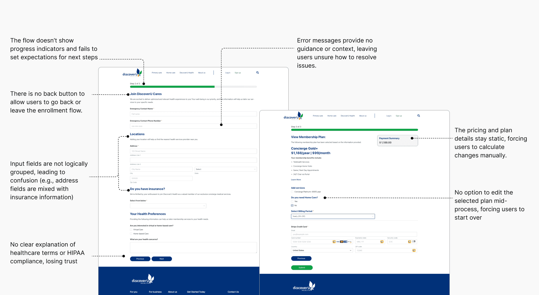
The enrollment flow lacked structure, users faced unclear inputs, repeated steps, and broken logic across both insured and uninsured paths. Plan pages didn’t clearly explain concierge services or guide users through eligibility, pricing, or value. Flows felt disjointed, and critical information for users above and below 65 was buried or missing.
42%
Form Abandonment Rate
Users dropped off due to unclear steps and repeated inputs.
65%
Plan Selection Uncertainty
User interviews revealed most users couldn’t identify the right plan for their needs.
38%
Restarted Flow
Analytics showed that users exited and re-entered enrollment from the homepage.
Solution highlights
Reframed care model and plan structure for clarity, relevance, and confident decision-making across user groups.
I restructured the plan tiers by separating core services from add-ons, removed unclear labels like “65+ only” from under-65 plans, and introduced a side-by-side tier comparison with clear pricing and plan highlights. I collaborated with health professionals and the co-founder to redefine service offerings, making it easier for users to scan, compare, and confidently select the plan that fits their needs.
Simplified the fragmented enrollment into a clear, guided flow for insured and uninsured users.
I redesigned the fragmented form flow by moving insurance selection upfront, splitting complex steps into smaller, logical stages, and showing billing details alongside inputs. This helped users understand their options sooner and reduced errors from backtracking.
Impact
My design work led to faster sign-ups and higher member enrollments within 3 months of launch.
40%
Faster sign-up completion
Redesigned form structure, upfront eligibility checks, and guided flows reduced confusion and sped up the process.
30%
Higher member conversion
Clearer plan value, personalized care paths, and simplified UI led to more users completing enrollment.
23%
Reduced enrollment drop-off
Iterative design changes helped more users move smoothly through the flow without exiting.
Process
I led discovery through validation within a tight 12-week timeline, helping the team stay aligned with product deadlines.
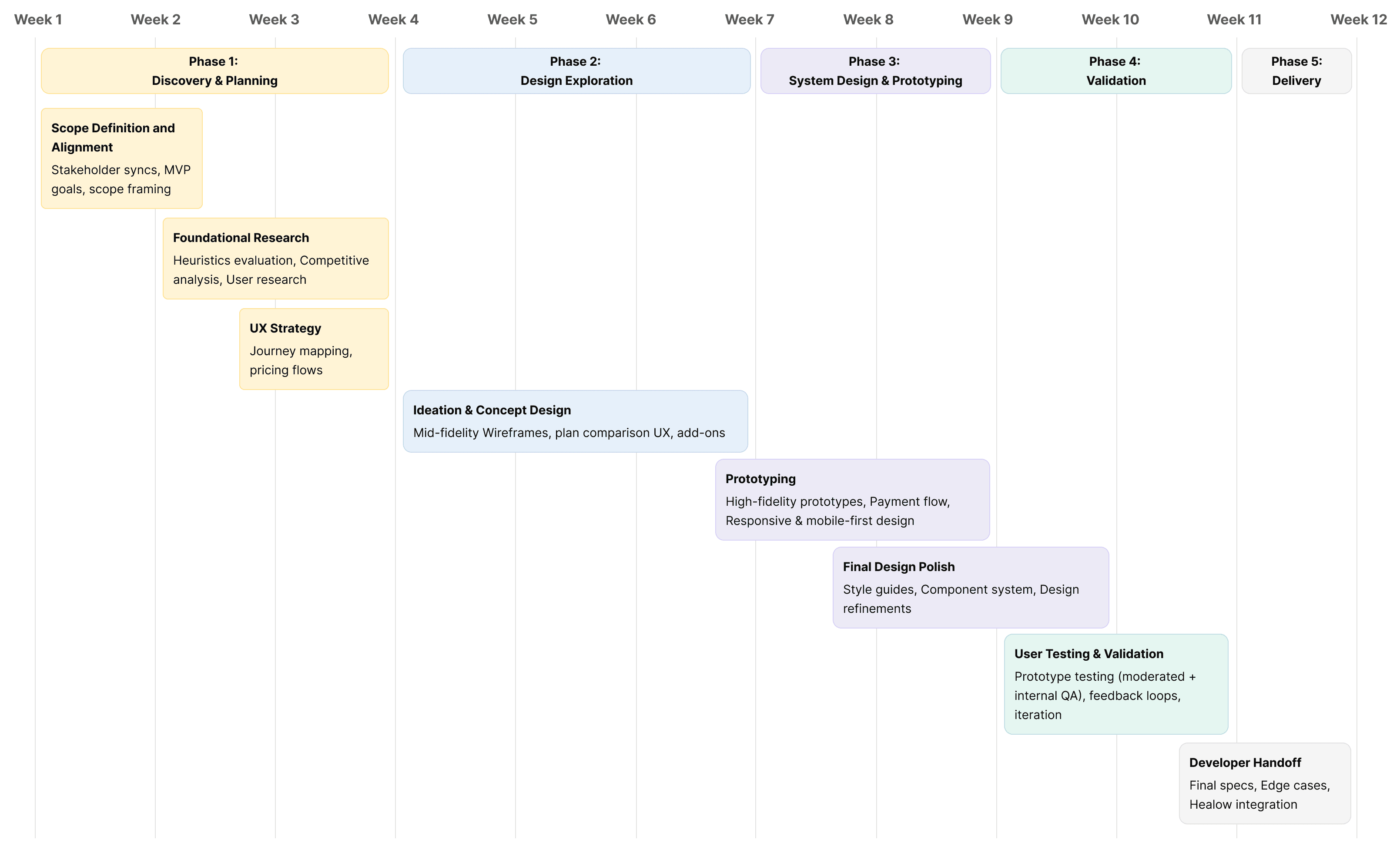
Heuristic analysis
I unconvered major usability issues across the existing website and member enrollment flow.
I audited the website and enrollment flow using Nielsen’s 10 usability heuristics, surfacing key issues like unclear CTAs, hard-to-find information, and lack of clarity and clear path for insured vs. uninsured users. The experience was inconsistent and overwhelming, especially for older users and first-time visitors.

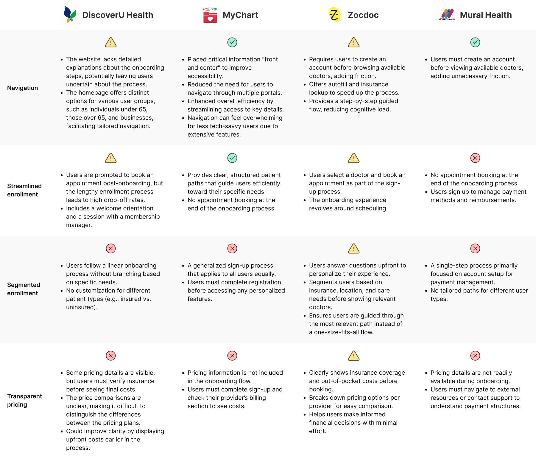
Competitive Analysis
I assessed our direct competitors to better understand the user landscape and identify areas for refinement.
I reviewed competitor platforms to benchmark navigation, insurance enrollments, and healthcare positioning. Most competitors lacked clarity around pricing and plan tiers. These insights helped shape a more transparent and personalized experience for DiscoverU Health users.
User Interviews
I conducted 10 user interviews to understand why users hesitated to trust or complete the enrollment flow.
I conducted qualitative research across both age groups and insurance types to uncover what users needed, what they expected from the website and the enrollment flow, and why they weren’t completing enrollment. These interviews revealed gaps in trust, missing plan context, and uncertainty around pricing and eligibility.
I just want to know if I can enroll without insurance, but it doesn’t guide me anywhere.
-P3, age: 40, Male, Uninsured
I have to re-select my plan, it is confusing and it throws me off. It should be simpler.
-P5, age: 45, Female, Uninsured
I can’t tell what’s actually included in my 65+ concierge plan vs. what Medicare covers.
-P1, age: 72, Male, Insured
Design opportunities
To turn research into action, I prioritized and categorized insights to guide design decisions.
To synthesize research findings, I grouped recurring usability issues into actionable insights and framed design opportunities as “How might we” questions. This helped align the team around clear problem areas and set the direction for solution exploration.
There was a lack of guidance in the enrollment flow and no clear distinction between plans for users above and below 65.
How might we design distinct enrollment flows for users above and below 65, with added support for older insured users?
Users weren’t prompted to check insurance early, leaving them unsure about eligibility and which plans applied.
How might we introduce upfront insurance checks to guide users into the right plan flow and reduce confusion?
Users couldn't clearly tell what’s included in each plan and what’s considered add-ons, especially during or before checkout.
How might we make plan coverage and add-ons more transparent to support confident decision-making?
Design Opportunity 1
How might we personalize the flow based on insurance status to reduce friction and show relevant plan options?
User flows
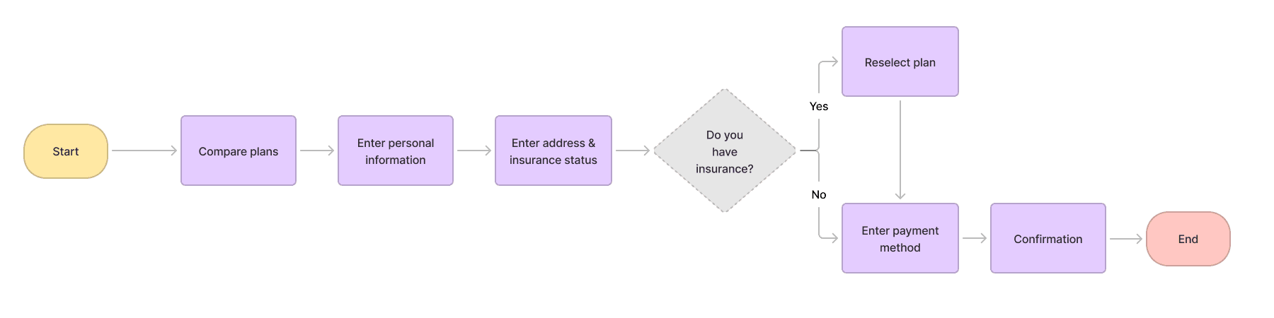
I redesigned the enrollment flow to clearly separate the experiences for users above and below 65, tailoring each path to match their coverage, care needs, and expectations.
The original enrollment flow treated all users the same, regardless of age or insurance coverage. This led to confusion, drop-offs, and misaligned care selection, especially for users above 65 with Medicare.
Existing flow (Above & Below 65)
I streamlined the enrollment flow for both under 65 and above 65 users by breaking down complex steps into simpler, guided stages. Based on whether users selected an insured or uninsured path, the flow adapted with early insurance validation, plan re-selection when needed, and care-setting choices like virtual or home-based, ensuring clarity, relevance, and continuity throughout.

New flow (Below 65)

New flow (Above 65)
Design Solution
Tailored enrollment path for above 65+ users.
While both flows shared core design improvements, the 65+ user flow included specific additions, clearer representation of add-on services, the ability to choose between virtual or home-based care, and progressive disclosure to reduce complexity.
Highlighted recommended add-ons based on Medicare, Medicaid, or private insurance.
Added home-based and virtual care options before payment to set clear care expectations upfront.
Kept selected plan and pricing visible throughout the flow for clarity and context.
Design Opportunity 2
How might we introduce upfront insurance checks to guide users into the right plan flow and reduce confusion?
Validating designs with users
I ran quick usability tests to validate early layout options and improve the insurance flow.
To test how users understood eligibility and uninsured plan selection, I conducted rapid concept testing using clickable prototypes. I compared three layout variations with 6 participants to evaluate clarity, decision confidence, and ease of navigation. Insights from this helped inform the final direction and reduce user friction.

Opt 1
Pros:
Simple UI, fast to scan
All-in-one view
Cons:
Lacked healthcare-specific context
No guidance for users without insurance

Opt 2
Pros:
Split section with summary
Full pricing and billing breakdown upfront
Felt complete and transparent to some users.
Cons:
Add-on selection was cluttered and disconnected from the care plan context
No support for users without insurance

Opt 3
What worked:
Clear question upfront guided users into the right flow
Progressive disclosure reduced overwhelm
Uninsured users had a clear entry point
Add-ons separated into a dedicated screen, improving focus and decision-making
Design Solution
Checking insurance status upfront to guide users into the right plan flow with clarity and continuity.
I redesigned the flow to collect insurance details, provider, ID, and DOB, at the start. This allowed the system to validate eligibility early and guide users into the right flow (insured or uninsured), reducing friction and improving plan clarity.
Captured provider name, ID, and DOB early to validate coverage before next steps.
Redirected users with invalid insurance to relevant plan options.
Grouped key inputs fields to reduce backtracking and confusion
Design Opportunity 3
How might we make plan coverage and add-ons more transparent to support confident decision-making?
Stakeholder discussions
I restructured care plans structure to help users understand what’s covered by insurance and what’s included in concierge services.
To reduce confusion and align care offerings with real user needs, I collaborated with the co-founder and healthcare professionals to redefine plan tiers, clarify add-on services, and segment offerings by coverage type and age. This work laid the foundation for a more trustworthy, relevant enrollment experience
Design Solution
Simplifying plan selection to support confident decisions
After aligning with stakeholders on which services belonged in DiscoverU Health’s core offerings, I redesigned the plan layout to highlight coverage differences and make pricing more transparent. I also integrated it directly into the enrollment flow, allowing users to confidently revisit and update their concierge plan mid-way without losing context.
Let users switch plans mid-way during enrollment without losing progress.
Enabled quick toggle between monthly and yearly pricing for easier cost comparison.
Added ‘View Benefits’ link in the order summary to let users revisit offered services.
Developer Handoff
I created mobile-responsive designs and WordPress-ready files for smooth implementation.
I delivered fully functional, developer-friendly web and mobile designs compatible with WordPress CMS, ensuring easy implementation. The design elements were optimized for smooth integration, with reusable components and detailed guidelines for the development team to maintain consistency in layout, typography, and responsive behavior.
Reflection
This project challenged me to design for a complex, real-world healthcare experience, balancing business needs, user expectations, and technical constraints.
This project challenged me to design for a real-world healthcare experience, balancing business goals, user expectations, and WordPress-based technical constraints. Beyond solving usability issues, I helped influence how DiscoverU defined its offerings, communicated value, and structured internal design and handoff processes.
Constraints
Technical stack
The platform was built on WordPress, which limited flexibility in layout and interactions. I had to design within these implementation boundaries.
Ambiguity in plan offerings
The concierge care model was still evolving, which meant the product definition was unclear at times and required close collaboration with stakeholders.
Learnings
Design starts with asking better questions.
Digging into why users weren’t enrolling helped uncover deeper problems with messaging, structure, and flow, not just UI.
Clarity = conversion
Small design elements like early insurance validation, “popular” labels, and simplified comparisons reduced decision fatigue and helped users move forward confidently.
Team Impact
I didn’t just design screens. I helped shape the product, team processes, and direction at a startup level.
I introduced a more structured Figma handoff system with detailed flow logic and component documentation, which reduced dev back-and-forth and improved launch velocity.
The new structure also helped marketing teams align messaging with actual user needs, leading to more targeted acquisition strategies.