
Work
Work
Work
Fun
Play
Play
About me
About me
About me
Resume
Resume
Resume
Jump to section

Microsoft Teams
Designed accessibility features to help junior employees with surface dyslexia communicate in real-time video calls.
As the product designer, I collaborated with designers and PMs in a product management course at Indiana University to improve Microsoft Teams’ accessibility. We designed features that enhance real-time spelling, and chat participation, prioritizing neurodiverse users and inclusive communication.
My Role
Product Designer
Team
3 Designers, 2 Product Managers
Tools
Figma, Miro, Monday.com
Timeline
16 weeks (Sept 23' - Dec 23')
Contributions
Primary research, Secondary research, User persona, Feature prioritization, User persona, Concept ideation, High-fidelity prototype
Problem
Microsoft Teams video calls lack accessible written support, making it harder for surface dyslexia users to fully engage and contribute.
Junior employees with surface dyslexia struggle in Microsoft Teams due to spelling, grammar, and comprehension challenges. Without real-time support, they face anxiety, rely on workarounds, and risk being excluded as Teams becomes central to remote collaboration.
10%
Global population lives with dyslexia
A common learning difference that affects reading, writing, and language processing.
80%
Users struggle with written communication
Especially in fast-paced tools like Teams where accuracy matters.
60%
Users experience communication anxiety
Dyslexic users hesitate to contribute in chats or meetings due to fear of making mistakes in real time.
25%
Workplace tools have real-time accessibility
Most platforms lack built-in support during live collaboration, forcing users to rely on external tools or assistance.
Core Challenge
How might we make Microsoft Teams video calls more accessible for surface dyslexia users to support confident, real-time communication?
Solution highlights
I conceptualized 4 features to support real-time communication for users with surface dyslexia.
These features reduce spelling and reading barriers in Microsoft Teams, helping junior employees with surface dyslexia stay confident and engaged.

Jump to final designs
Impact
My design work improved writing accuracy, feature adoption, and accessibility experience through user testing.
40%
Reduction in spelling errors
Real-time writing aids like auto-complete helped users with surface dyslexia compose messages accurately without breaking flow.
30%
Uptick in feature adoption
Research-driven design led to more users adopting built-in accessibility tools over external workarounds, improving workflow efficiency.
4.75/5
User satisfaction score
3 testing rounds ensured the experience met user needs and accessibility standards, with strong feedback across clarity, ease, and confidence.
Process
My design work improved writing accuracy, feature adoption, and accessibility experience through user testing.

*Things I led
Understanding the problem space
I investigated the needs of dyslexic users, explored Microsoft’s accessibility gaps, and uncovered opportunities for inclusive communication design.
Secondary Research
Reviewed articles and studies to understand surface dyslexia and workplace communication challenges.
Digital Ethnography
Analyzed Reddit, Quora, and reviews to gather real user frustrations and unmet needs.
Product Audit
Assessed Microsoft Teams’ accessibility features to identify gaps in real-time communication support.
Secondary research
I conducted secondary research to understand how surface dyslexia affects written communication in digital workspaces.
I reviewed academic articles, accessibility blogs, and expert resources to explore how surface dyslexia impacts reading fluency, spelling accuracy, and user perception in professional settings. These findings grounded the problem space and informed early design decisions.
Digital ethnography
I conducted digital ethnography to uncover real user frustrations and lived experiences with surface dyslexia.
Due to limited access to direct users, I turned to platforms like Reddit and Quora to analyze real conversations. These insights helped me empathize with communication challenges and validate problem patterns for design direction.
It's not about reading difficulties; it's a constant battle with words flipping on the page.

My spelling is horrible and getting new things to stick in my memory is always a struggle.


I read or spell session as seshen; broad as brawd
Product audit
I audited Microsoft Teams to identify accessibility gaps in real-time communication for dyslexic users
I evaluated the Microsoft Teams desktop experience to understand how existing features support or overlook the needs of users with surface dyslexia. While tools like Immersive Reader exist, they’re limited to post-meeting use, revealing critical gaps in live captioning, spelling support, and overall written accessibility.
Research analysis
I evaluated and articulated potential opportunities, helping with the prioritization of high-impact areas and aligning the team on user needs.
Insights into opportunities
Based on the opportunity canvas, I identified four high-impact areas for improving accessibility in Microsoft Teams for users with surface dyslexia:
Support decoding during live meetings
Users need help recognizing unfamiliar words in real-time
Reduce spelling friction in live chat
Real-time auto-complete and spelling assist can ease anxiety and improve participation.
Customize text for readability
Captions and transcripts lack formatting options; users need control over size, spacing, and color.
Minimize reliance on external tools
Users draft elsewhere to avoid errors, in-platform writing support can streamline their workflow.
Design Principles
I applied accessibility-driven design principles to reduce cognitive load and ensure clarity for users with surface dyslexia.
These principles, grounded in WCAG 2.1 guidelines, shaped every design decision, ensuring cognitive ease, clarity, and inclusive communication for users with surface dyslexia.
Cognitive Accessibility
Allow users to read and process content at their own pace.
Prioritize clarity and comprehension over density.
Use consistent layouts and interaction patterns to build confidence.
Make features adaptable to a variety of cognitive and learning needs.
Easy to read
Use sans-serif, dyslexia-friendly fonts and avoid text embedded in images.
Apply accessibility standards:
Contrast ratio: Min. 4.5:1 for body text; 3:1 for larger text.
Font size: Min. 18pt for regular text, or 14pt bold.
Offer user controls for font size, spacing, and background contrast.
Feature prioritization
We designed 4 feature concepts rooted in user needs, then validated them through surveys to guide MVP decisions.
Each feature directly addressed a core opportunity area uncovered during research. After wireframing all four, we ran a Google Survey asking 50+ users to rate their usefulness. This feedback, combined with impact and feasibility analysis, helped prioritize two high-value features for our MVP.

Based on this prioritization, I moved forward with designing the MVP experience for two features:
Immersive Reader for Captions and Auto-complete in Chat.
Selected MVP features
Based on this prioritization, I moved forward with designing the MVP experience for two features: Immersive Reader for Captions and Auto-complete in Chat.
Final designs
Support decoding in real time via Immersive Reader
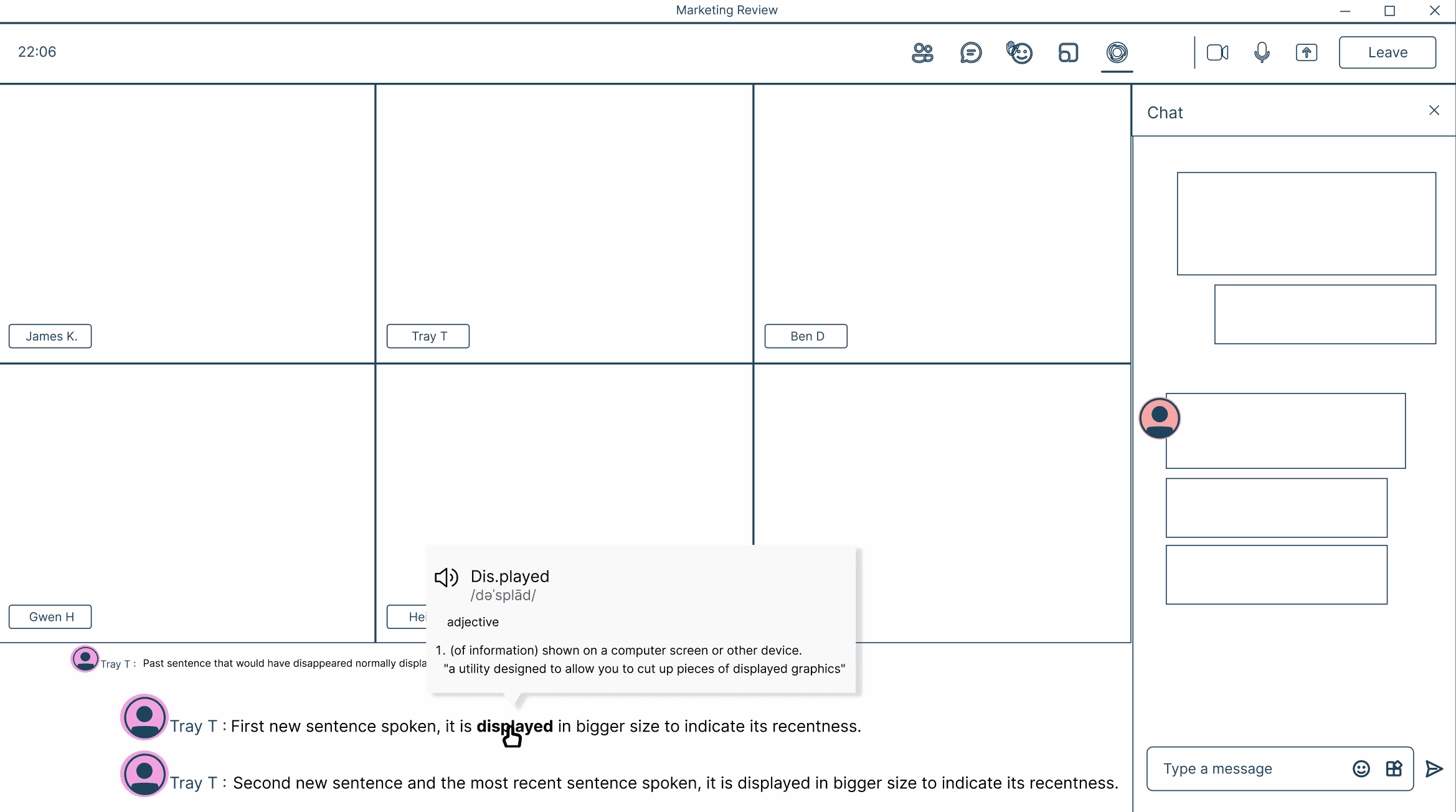
Users with surface dyslexia often struggle to recognize unfamiliar words in fast-paced conversations. This feature lets users hover over words in live captions to reveal a simplified definition, phonetic breakdown, and optional read-aloud playback.
Caption styling supports 18pt font and high-contrast mode.
Interaction avoids tooltips or fast transitions that increase cognitive load.
Read-aloud uses Microsoft’s existing speech synthesis engine.
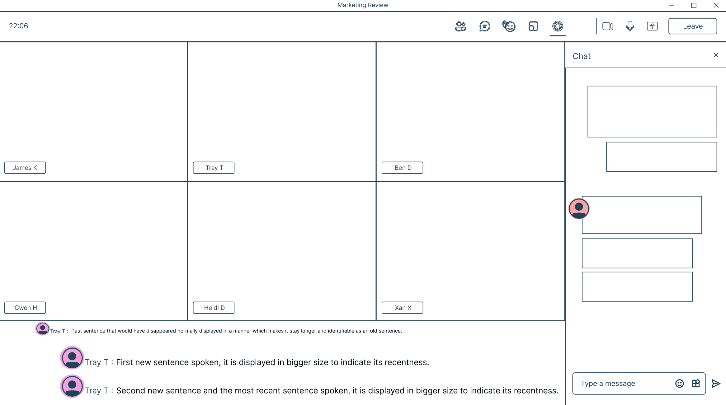
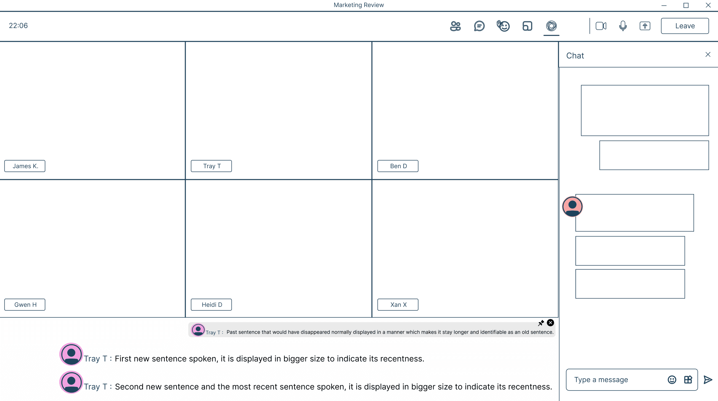
Reduce spelling friction in live chat through Auto-Complete
Spelling anxiety limits real-time participation. This feature predicts the next word as users type, allowing them to accept suggestions with a keystroke, improving speed and accuracy.
Suggestions respect dyslexia-friendly font styles
Spacing and input box size optimized for readability
Predictable, low-distraction interactions
Reflection
This project challenged me to push boundaries, grow new skills, and design with purpose, creating something that could make a social impact.
Learnings
Accessibility isn’t one-size-fits-all
Empathy and ongoing testing are key to inclusive design. Focusing on edge cases, like surface dyslexia, can improve the experience for everyone and drive better overall usability.
Balancing innovation with familiarity
Even innovative features like Immersive Reader and Auto-Complete succeeded because they felt intuitive and aligned with familiar user workflows.
Timeboxing for focus
Sprint planning helped us prioritize high-impact features within tight deadlines. Timeboxing design, testing, and implementation kept the team focused and the project on track.
Next steps
WCAG 2.2 Compliance Review
Conduct a formal accessibility audit to ensure both features meet updated accessibility standards across devices
Enhancing AI Support
Next, I would explore integrating AI-powered tools for real-time speech-to-text correction and grammar assistance, offering smarter writing support for users with dyslexia.
Broadening Accessibility for Neurodiverse Users
Expanding these features to support users with dysgraphia, ADHD, and other neurodiverse conditions is a natural progression.