
TypeIt
Redesigning TypeIt’s mobile and web experience to simplify wallet connection, improve referral workflows, and enhance content scannability.
I collaborated with product and engineering to improve TypeIt’s onboarding and dashboard experience. Our redesign focused on simplifying the wallet linking flow, improving the invitation dashboard, and creating a more scannable content layout for crypto-earning typists.
My Role
Team
3 Designers, 1 Product Manager, 2 Developers
Tools
Figma, FigJam, Adobe Illustrator and Photoshop
Timeline
12 weeks (May 23' - July 23')
Contributions
Primary research, Secondary research, User persona, Feature prioritization, User persona, Concept ideation, High-fidelity prototype
Problem
The Web3 experience on TypeIt was fragmented, error-prone, and overwhelming, slowing users down and hurting conversion
After joining the project, I reviewed early usability notes, analytics, and internal feedback gathered by the team. These insights revealed three critical issues slowing users down and lowering conversion:
62%
Users failed to link their wallet in one go
Users got stuck during the wallet connection or smart contract approval.
28%
Longer time spent completing key flows
Users spent significantly more time navigating the product due to unclear information architecture and repetitive steps.
1/15
Skipped NFT profile customization
Despite being a core feature, most users abandoned the NFT setup flow due to overwhelming options and unclear value.
Solution highlight
I redesigned TypeIt’s core flows to reduce friction, clarify actions, and support faster decision-making
I led rapid design sprints to simplify wallet linking, fix errors in referral generation, and restructure the invitation dashboard—removing blockers and improving flow continuity across mobile and desktop.
Impact
My work increased task completion, improved flow continuity, and made Web3 actions feel more intuitive.
18%
Increase in successful wallet connections
Reduced the transaction flow from 8 to 5 steps by simplifying Wallet Connect interactions and clarifying smart contract approvals.
28%
Faster navigation through core features
Restructured the dashboard layout and content hierarchy after identifying friction points via usability testing.
35%
Uplift in platform interaction
Designed 800+ NFT profile templates with motion graphics to support user personalization and creative expression.
Process
I took ownership of translating early feedback into clear, actionable design decisions.
After joining the project, I reviewed usability feedback, product metrics, and PM notes to identify core issues. From there, I prioritized fixes, mapped out opportunities, and iterated on key flows—focusing on usability, clarity, and reducing task friction across devices.
Research analysis and key insights
I grounded my redesigns in user behavior and feedback to drive high-impact improvements.
I analyzed usability testing session logs, internal feedback, and product analytics to surface the root causes behind user friction, guiding what the redesign should focus on fixing first.
Unclear Wallet-Linking Steps
Vague permissions and disconnected steps caused confusion during wallet setup, leading to frequent errors and 30% abandonment.
No Invitation Tracking
Users had to manually track referral rewards. This created friction, confusion, and lowered engagement
Fragmented Content Structure
Key actions and value props were buried in dense layouts, making it hard for users to understand the platform’s value.
Project goals
Based on the top pain points from research, I collaborated with the PM to define three focused goals — each driving design decisions to reduce friction, simplify flows, and increase engagement.
01
Reduce friction in the wallet linking process by minimizing steps, improving clarity, and supporting seamless cross-device authentication.
02
Eliminate manual referral tracking by surfacing rewards and simplifying sharing, improving usability and increasing engagement.
03
Redesign layout using visual hierarchy and semantic grouping to make actions more scannable and help users quickly grasp the platform’s value.
User Persona
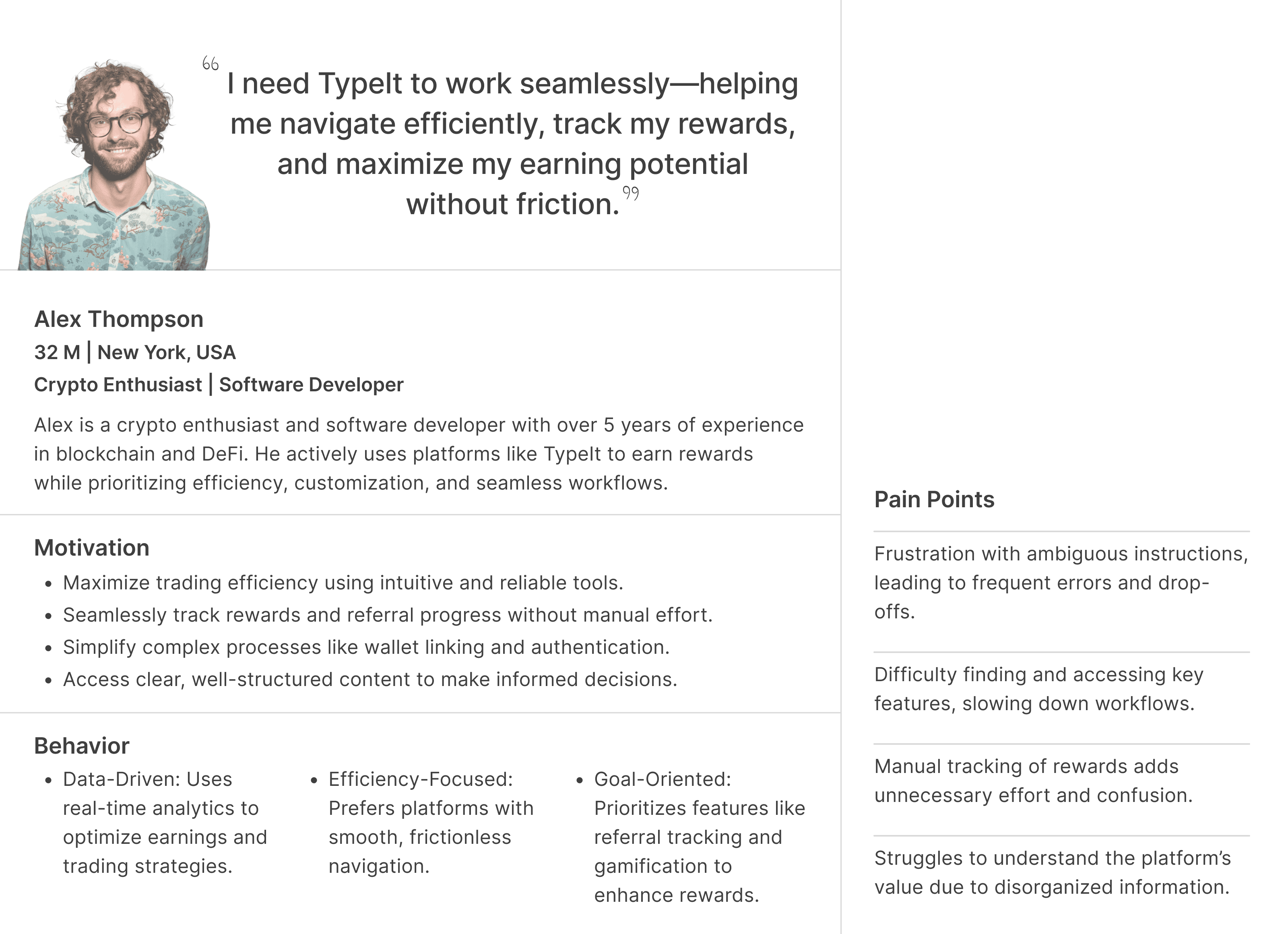
I distilled patterns into a single persona to keep decisions focused and cross-functional alignment tight.
After surfacing key pain points, I mapped overlapping behaviors and motivations into a focused persona. This helped the team quickly align on who we were solving for, streamline prioritization, and gut-check features against real user needs throughout the project.
User Journey Mapping
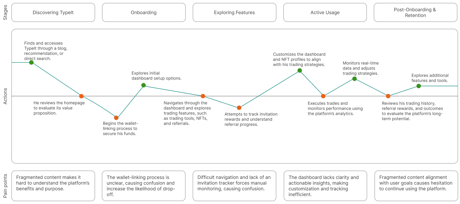
To spot moments of friction and opportunity, I mapped the end-to-end user journey across wallet connection, dashboard, and reward flows.
Building on the persona, I created a user journey map to visualize friction across core tasks, from wallet connection to tracking rewards. This revealed where users dropped off, struggled to find clarity or lost trust, and helped me prioritize what flows to simplify first.
Final designs
I redesigned core flows and interface components to improve clarity, reduce friction, and support cross-platform usability.
Using insights from research and goals as a foundation, I focused on simplifying wallet interactions, improving navigation structure, and enhancing personalization with visual design.
Goal 1
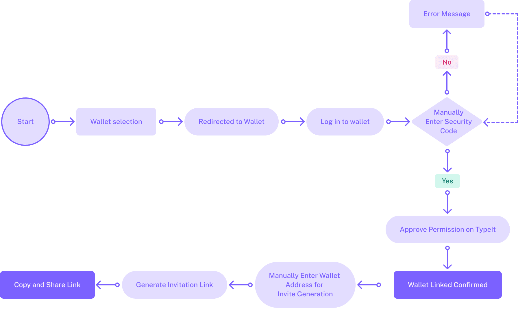
I redesigned the wallet connection flow to reduce setup friction and guide users with fewer steps.
The original flow had redirects, login errors, and manual inputs — causing 30% user abandonment. Using insights from the persona and journey map, I rebuilt the experience with fewer steps and less decision-making. This new structure minimized effort, eliminated confusion, and worked seamlessly across mobile and desktop.
Before

After
Design decision 1
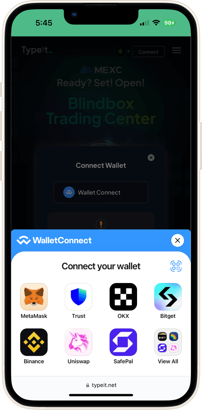
To reduce friction and avoid multi-step redirects, I made WalletConnect the default method for logging in.
The original flow required switching apps and logging in manually — often breaking task continuity and increasing setup time. By integrating WalletConnect, users could securely connect their wallets via a quick QR scan. This simplified authentication, reduced errors, and ensured a seamless experience across mobile and desktop.
Design decision 2
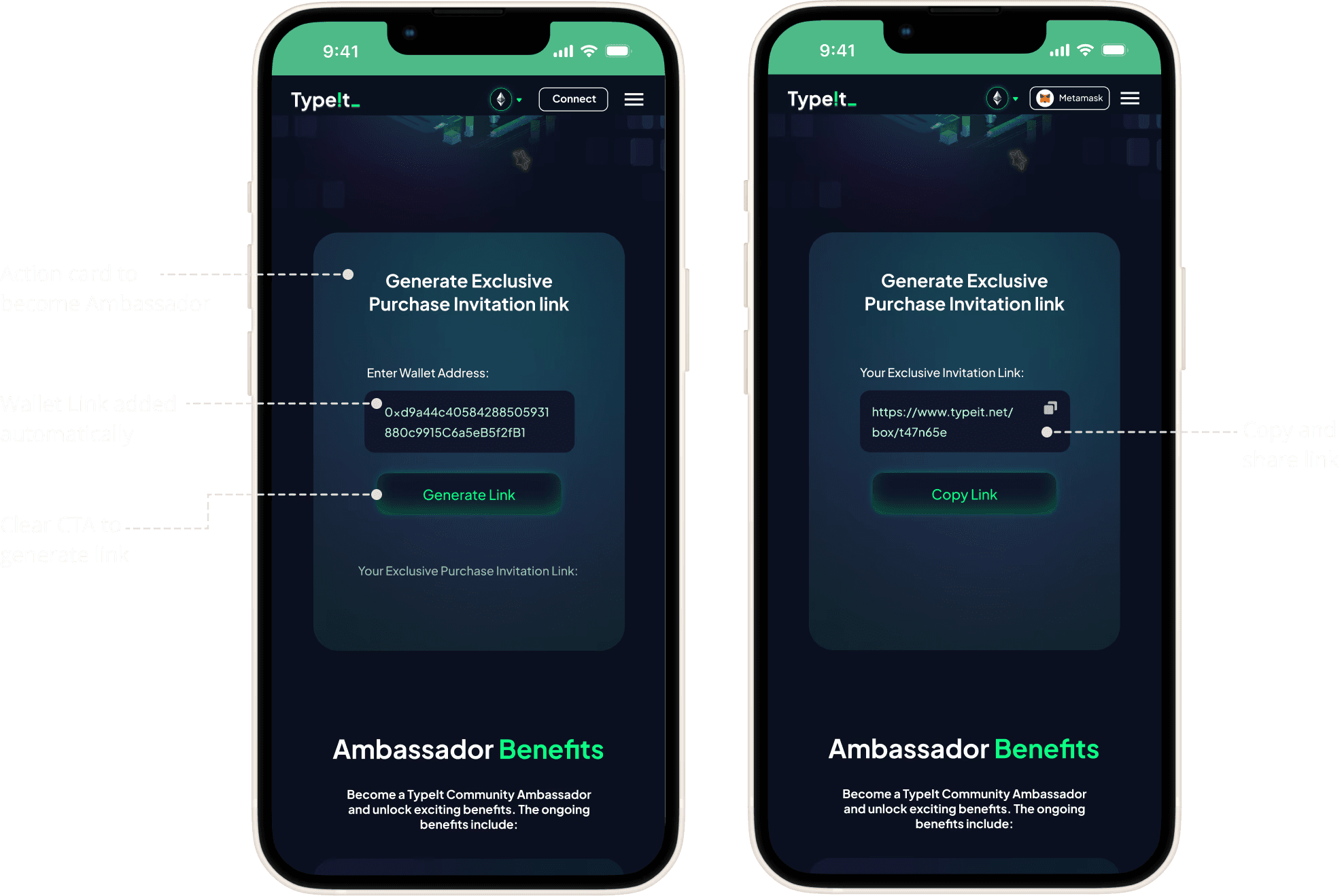
1-click referral sharing with auto-filled wallet address
After login, users saw a pre-filled action card with their wallet address and a clear CTA to generate a referral link. This context-aware design eliminated manual input, reduced errors, and made the invite process feel seamless and intuitive.
Key improvements
Reduced the number of steps from 8 steps to 5 steps.
Auto-filled wallet addresses simplified the invitation flow.
Integrated QR scan eliminated manual errors and sped up the process.
Step-by-step tooltips guided users through the process clearly.
Goal 2
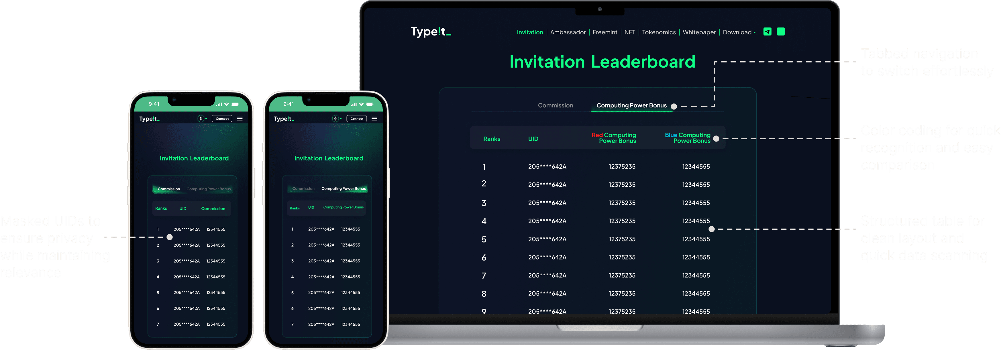
Built a structured dashboard to help users track referral rewards with ease
I designed a clean, tabbed dashboard with clear hierarchy, color-coded data, and responsive tables—making referral performance easier to scan, compare, and track. This reinforced continuity in the user journey and supported decision-making with minimal effort.
Goal 3
I redesigned fragmented content to improve scannability, comparisons, and trust.
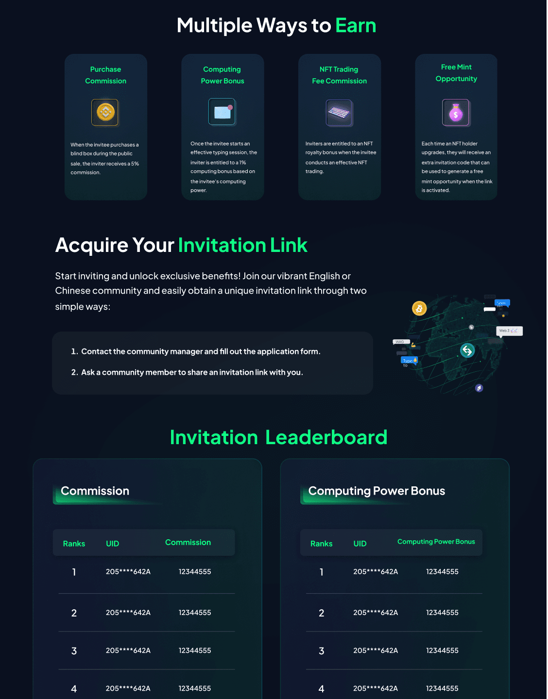
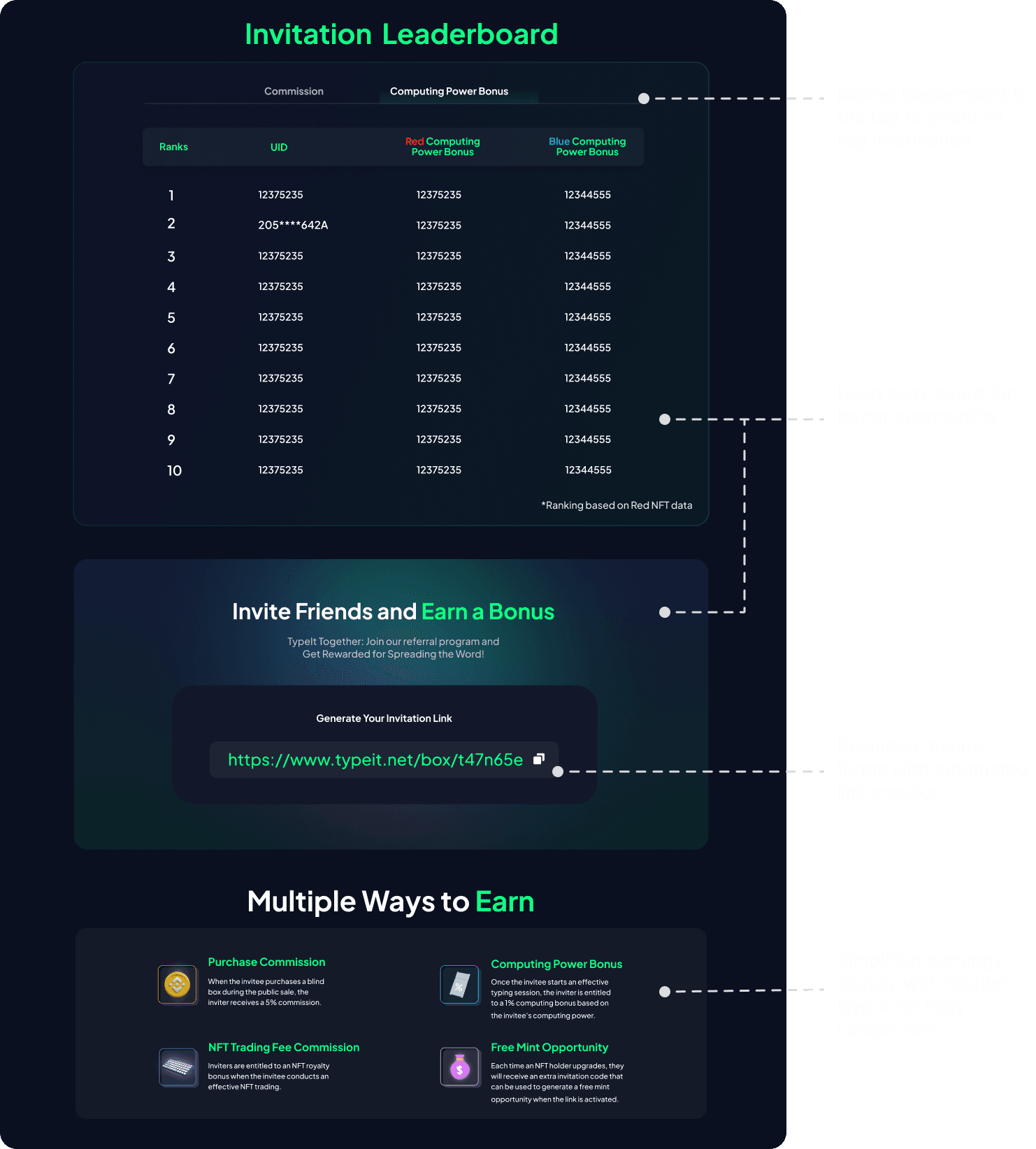
The original Invitation and Tokenomics pages buried key information and made comparisons difficult. I redesigned the content structure using card layouts and semantic grouping to make actions more scannable, comparisons easier, and content more accessible.
Before
The Invitation page lacked a clear hierarchy, with buried key information, fragmented workflows, and poor grouping hindering navigation and comparisons.
After
I used card layouts and tables to prioritize key actions, improving scannability and streamlining referral workflows.
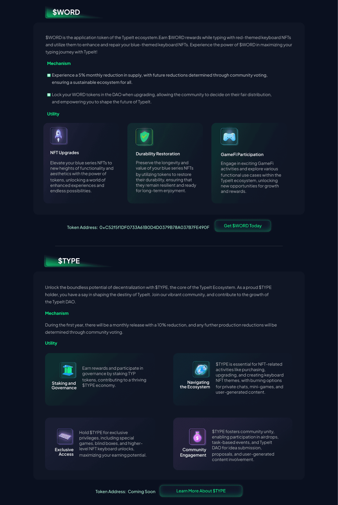
Before
Scattered content and inconsistent layout made it difficult to compare $WORD and $TYPE, increasing effort.
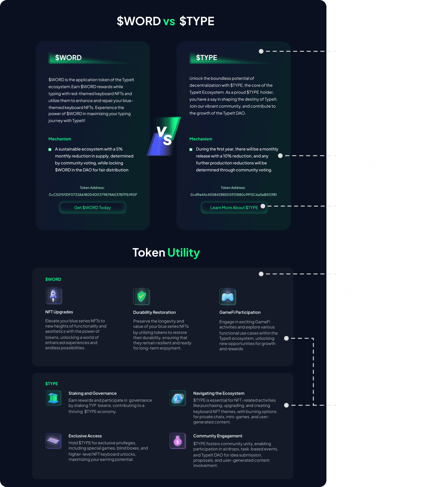
After
I applied semantic grouping and visual consistency to simplify comparisons and reduce cognitive load.
Key improvements
Prioritized leaderboard and utility info to improve task clarity.
Simplified content using clear labels, semantic grouping, and progressive disclosure.
Reflection
Working on TypeIt pushed me to design for clarity and trust in a fast-moving, ambiguous Web3 environment—balancing team velocity with user confidence.
Constraints
Remote collaboration across time zones
The team was split between China and the U.S., making real-time collaboration tricky. To stay aligned, I adapted to async workflows, sharing progress proactively, documenting design decisions clearly, and leaning on tools like Slack, Loom, and Figma for smooth handoffs.
Evolving scope & unclear requirements
Requirements often changed or came late. I learned to map out assumptions, ask sharper questions, and use early mockups to get quick alignment, reducing rework and decision paralysis.
Learnings
Designing for velocity
In a fast-paced startup environment, I learned how to scope just enough, make quick, intentional decisions, and focus on unblocking the team without compromising usability.
Building trust in unfamiliar systems
Web3 often feels intimidating to new users. This project taught me to prioritize clarity, reduce cognitive load, and build flow continuity to help users feel in control and confident throughout.
