
Type!t
Redesigning TypeIt’s (Web3) mobile and web app by simplifying the wallet linking process, invitation dashboard, and content layout.
TypeIt is a Web3 application by DeFiner Labs that gamifies typing. It enables users to earn cryptocurrency through an integrated keyboard. The application features NFTs to enhance earning potential, NFT trading and a marketplace.
My Role
UX/UI Designer
Team
3 Designers, 1 Product Manager, 2 Developers
Tools
Figma, Miro, Adobe Illustrator
Timeline
May 23' - Aug 23'
Skills
Idea Generation, Journey Mapping, User Flows, UI and Visual Design
Problem Space
TypeIt faced critical usability challenges that impacted user engagement and retention.
01
How might we simplify the wallet-linking process to reduce errors and drop-off rates?
02
How might we improve the website’s navigation and content structure to make it easier for users to access key features and understand the platform’s value?
My contribution
I led the redesign of TypeIt’s Web3 app and website. My key contributions included simplifying the wallet-linking process, creating a new invitation dashboard, and optimizing the content layout to improve usability. I also designed 800+ customizable NFT profiles to enhance user engagement and ensure seamless platform integration.
My contributions led to
20%
Boost in trade executions through revamped information architecture and integrating invitation dashboard.
23%
Increase in conversion rates by introducing the wallet-linking process via Wallet Connect.
800+
Growth in engagement through the design of 800+ customizable NFT profiles.
Discovery
When I joined the Type!t project, the team had already conducted usability testing and stakeholder interviews on the existing product.
Analysis & key insights
I categorized the outcomes into three main areas to make sense of the findings, allowing us to focus on key improvements and align our efforts with user and stakeholder needs.
Unclear Wallet-linking steps
Instructions for granting security permissions and transaction approvals were ambiguous, leading to frequent errors and 30% high abandonment rates.
Absence of Invitation Tracking
Users had to manually monitor rewards, causing confusion and reducing engagement in referral campaigns.
Fragmented Website Content
Many struggled to understand the platform’s core value proposition, especially first-time users trying to evaluate its benefits.
Refining user persona
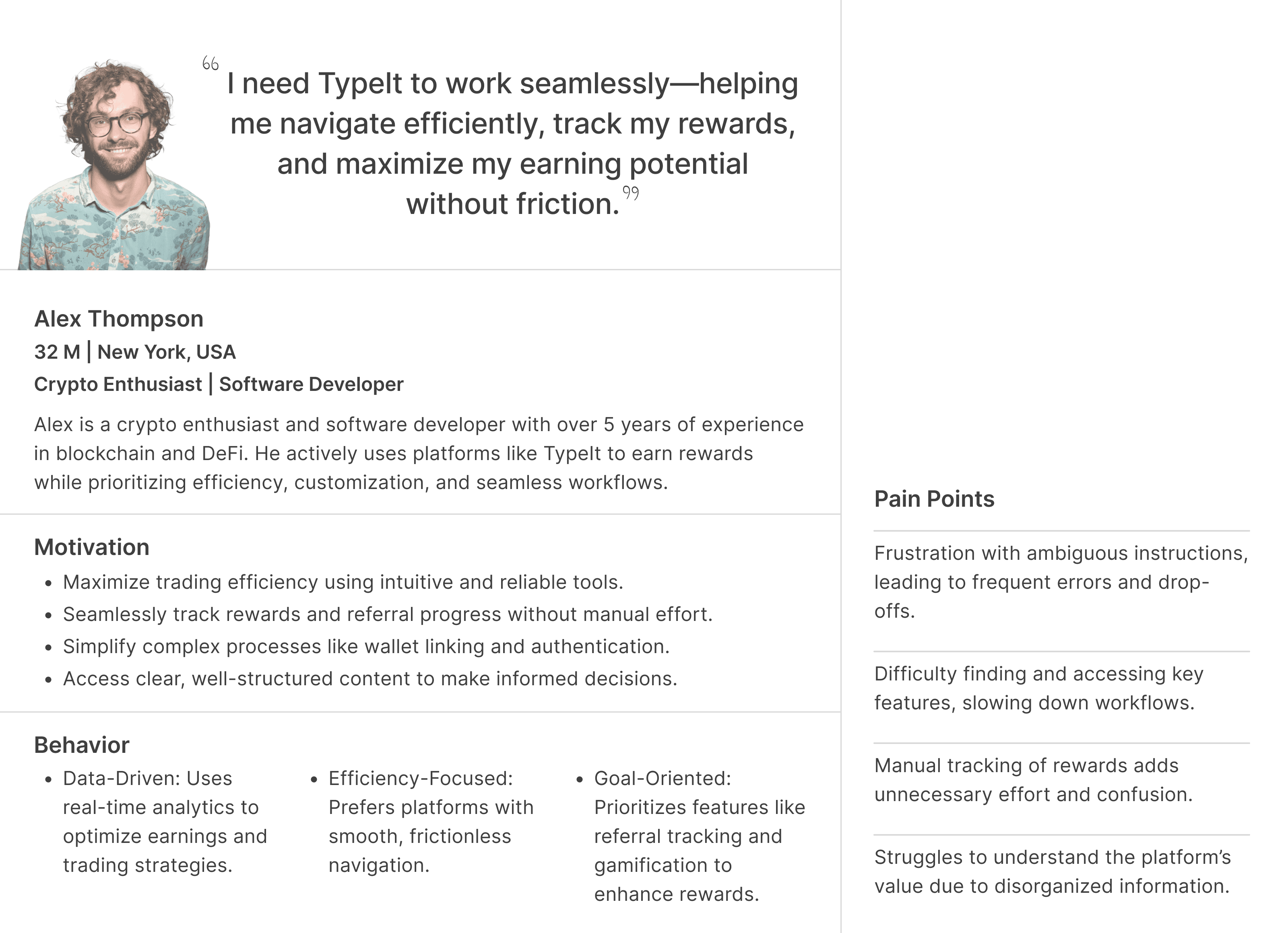
Before the redesign, I created a user persona to align the team and highlight key user motivations, pain points, and behaviors, ensuring the design addressed real user needs.
User journey map
I created the user journey map to identify key pain points, such as the complex wallet-linking process and unclear content organization. This guided our design improvements, ensuring a more intuitive and engaging user experience on the TypeIt platform.
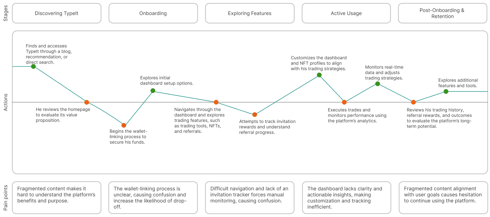
All the problems appeared distinct but were interconnected, ultimately influencing both the user experience and the business growth of TypeIt.
Challenge 1
How might we simplify the wallet-linking process to reduce errors and drop-off rates?
Streamlining Wallet-Linking
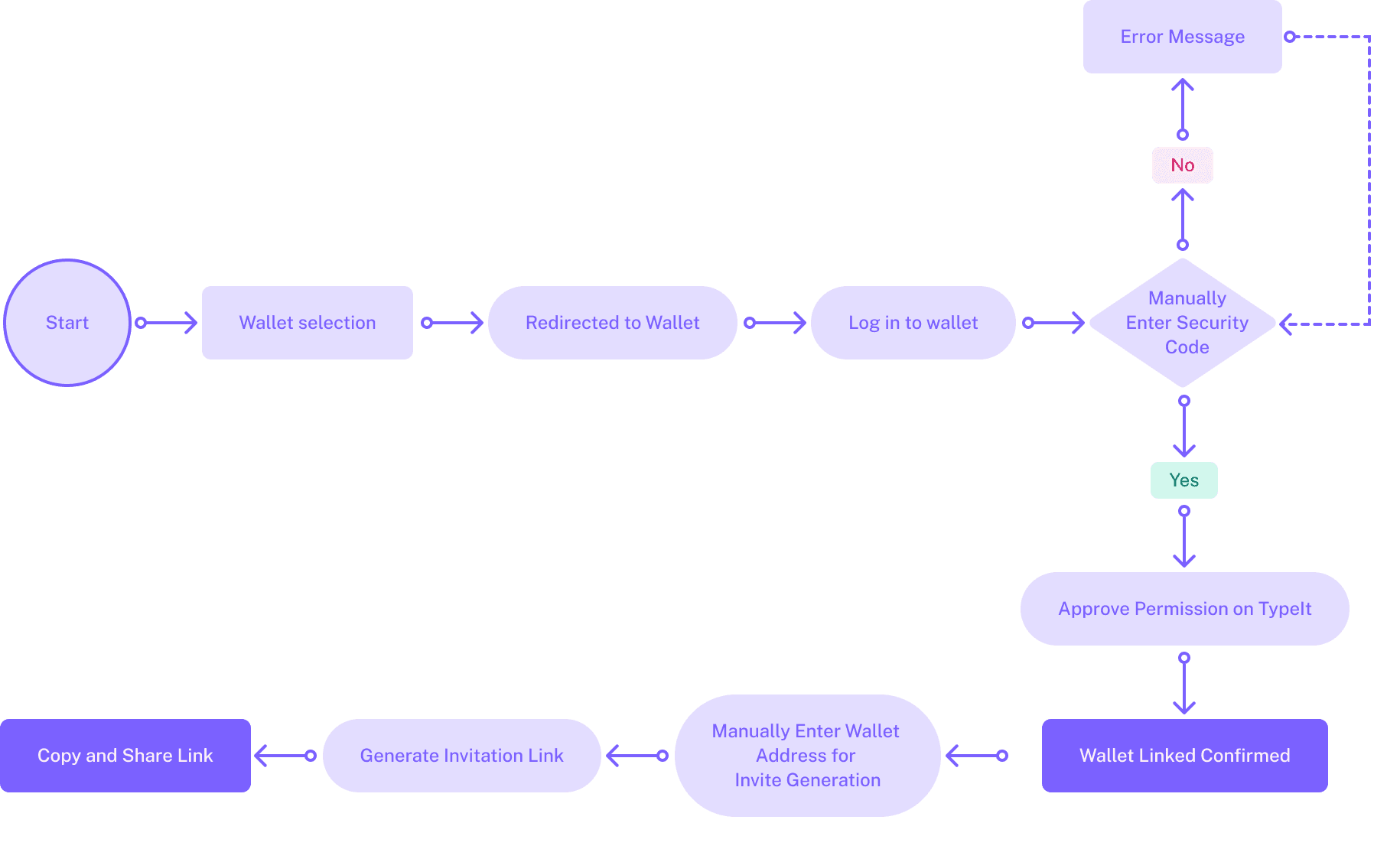
The wallet linking process was complex and manual, leading to frequent errors and user frustration. Simplifying wallet linking with instant invitation generation streamlines the user journey, reducing interaction costs and maintaining task continuity. This context-aware design promotes seamless engagement, enhancing user satisfaction and increasing conversion rates.
Before
After

01
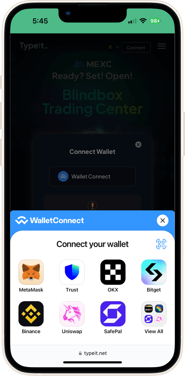
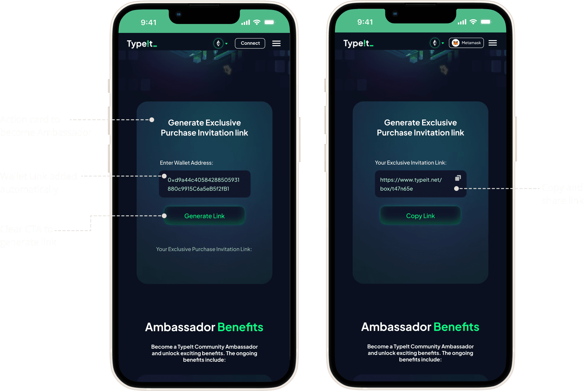
Seamless wallet connection with WalletConnect
I integrated WalletConnect, allowing users to connect their wallets through a quick QR code scan. This streamlined the process, eliminated manual steps, and enhanced both security and user experience.
02
Automated invitation link creation
I simplified the process by auto-filling the wallet address after connecting via WalletConnect, added a clear CTA for generating the invite link, and enabled easy one-click copying and sharing of the link. This helped in enhancing usability and streamlined the referral process.
Key Improvements
Reduced the number of steps from 8 steps to 5 steps.
Integrating QR Code Scan eliminated manual errors and made the process faster.
Automatic population, streamlining the invitation creation process.
Step-by-step tooltips guided users through each stage of the wallet-linking process.
Challenge 2
How might we improve the website’s navigation and content structure to make it easier for users to access key features and understand the platform’s value?
Improving the Content Layout
I redesigned the Invitation and Tokenomics pages to resolve fragmented content and improve usability. By enhancing the information hierarchy and applying clear layouts, I made key information accessible and streamlined workflows.
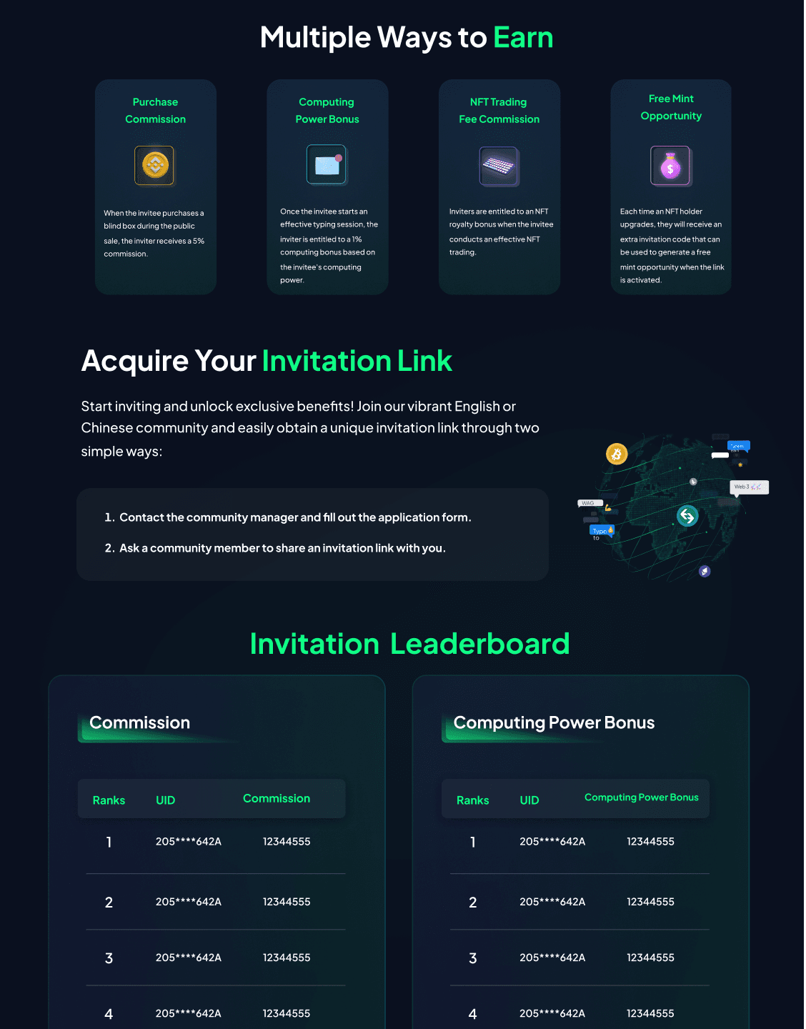
Before
The Invitation page lacked a clear hierarchy, with buried key information, fragmented workflows, and poor grouping hindering navigation and comparisons.
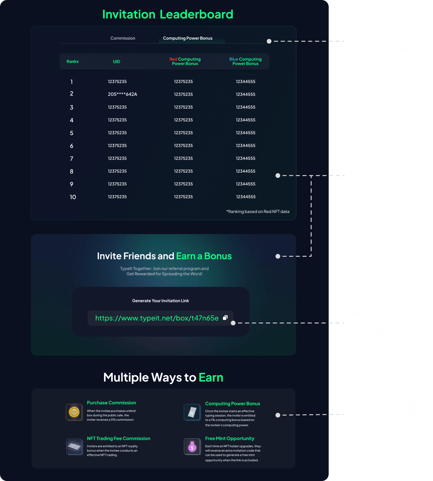
After
I implemented a card-based layout and tabular format to improve scannability and comparison.
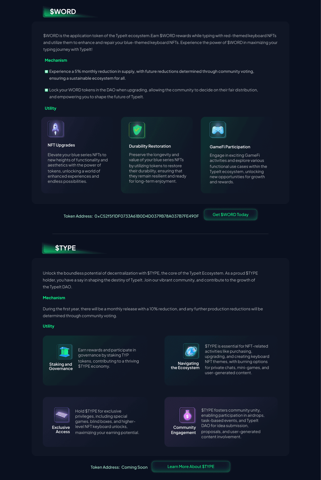
Before
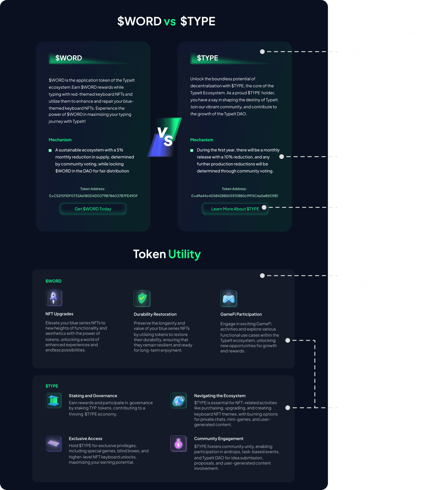
The Tokenomics page's scattered information and inconsistent layout made comparing $WORD and $TYPE difficult, increasing cognitive load and reducing usability.
After
Semantic grouping and consistent layouts improved clarity and accessibility.
Key Improvements
Prioritized key elements like the leaderboard and utilities for intuitive navigation.
Applied clear labels, semantic grouping, and progressive disclosure to simplify complex information.
Designing the Invitation Dashboard
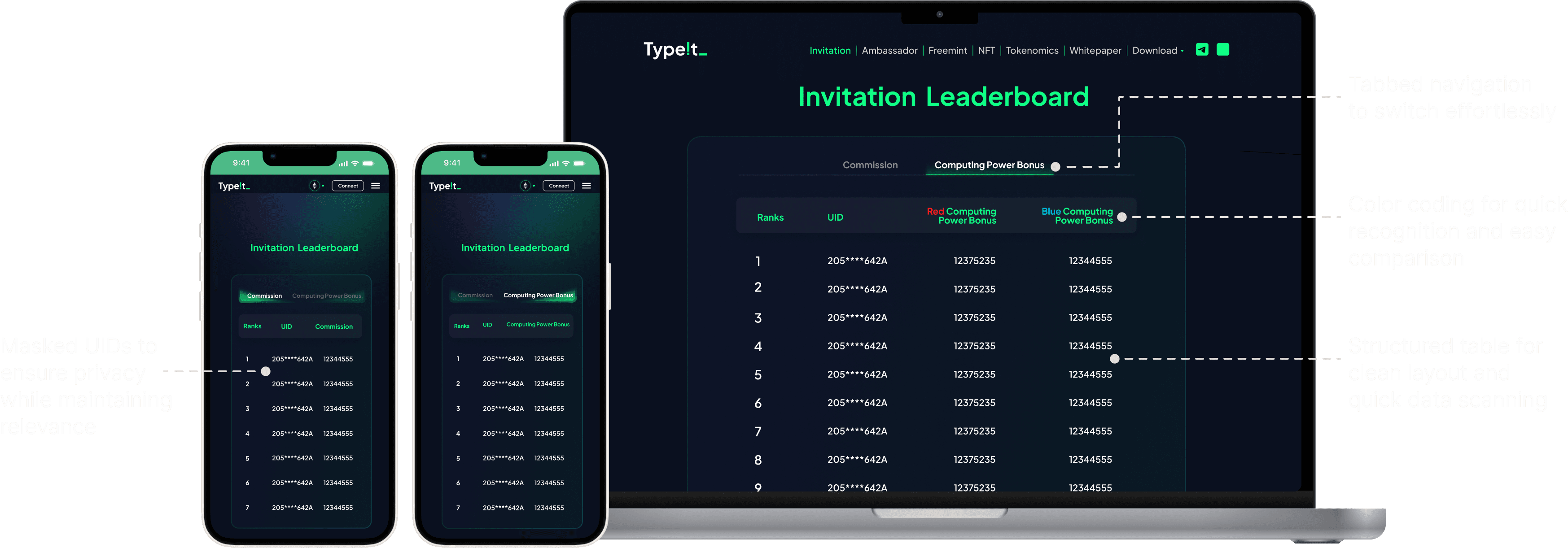
I designed the invitation dashboard to give users a clear view of their invitation performance and rewards. By organizing metrics like Commission and Computing Power Bonus in a structured, easy-to-navigate format, the dashboard simplifies tracking and boosts transparency.
Key steps in handoff process
Developer handoff
After finalizing the design, I worked closely with the developers to ensure a seamless transition from design to implementation. Given the complexity of the Web3 functionalities in Type!t, aligning on both technical and design requirements was critical.
Comprehensive Documentation:
I created a detailed design specification document that included:
Component layouts and spacing guidelines.
Interaction patterns and states (e.g., hover, active, error).
Visual assets, including icons, typography, and color codes.
Collaborative Communication:
Regular meetings with the development team helped address questions and align on technical feasibility.
Tools like Slack and Asana were used for asynchronous communication, ensuring clarity despite time zone differences.
Reflection
Constraints
Adapting to Remote Dynamics
Adapting to remote collaboration required overcoming language barriers, time zone differences, and delays in feedback. By leveraging tools like Slack, Asana, and Gather, I established workflows to ensure consistent updates and alignment. This experience enhanced my ability to manage communication across global teams effectively.
Dealing with Ambiguous Requirements
In fast-paced environments, I often encountered incomplete or ambiguous requirements. To address this, I proactively collaborated with stakeholders to clarify goals, ensuring alignment and reducing rework. This strengthened my ability to manage uncertainty and deliver effective solutions.
Learnings
Handling Multiple projects
Balancing multiple roles in a small, fast-paced team taught me to prioritize tasks effectively, manage time efficiently, and adapt to changing requirements. This experience honed my ability to stay organized and deliver quality work under tight deadlines.
Advocating for Users in Business-Centric Environments
I learned to advocate for user needs while balancing business goals, ensuring that the final designs were not only user-friendly but also aligned with organizational objectives. This skill enhanced my ability to communicate the value of UX to non-design stakeholders.
Other projects
DeFi
Design System
B2B & B2C
ZooEx Design System
Developed a scalable design system with 40+ standardized components, reducing inconsistencies and cutting development time.
Thanks for visiting my portfolio!
I'm open to new opportunities and would love to hear from you.

